All My Nails Website Redesign
Type: University, Solo • Role: Designer • Length: 5 weeks • Programs Used: Figma, GlooMaps
.png)
The premise of this project was to select an existing website from a local business that I believed warranted a redesign, conduct a nuanced analysis (visual, content, usability), and redesign the site to address the issues found in our analysis.
I chose a local nail salon's website and redesigned their desktop site design using Figma, using GlooMaps to create a visual sitemap. This was a solo project in a course I took on web design and development.
An internal &
external makeover
Critique Methods
My design critique analyzed the current site's effectiveness in three areas: visual design and aesthetics, usability, and content.
The analysis was achieved by trying to accomplish imagined user tasks using their current site and noting if an issue from one of the aforementioned categories was hindering my ability to complete that task. For example, a broken button falls into the usability category.
Biggest issue:
Hard to find
key info
I had one main issue with the site design: the design was preventing the website from effectively serving its main purpose, which is to provide curious customers with pricing and service information.
Typically, with nail salons and other businesses, reviews and images can be easily found on the search page through a quick web search. Pricing information is usually not displayed on the search page and must then be found either in the business's social media page or website.
Because of this, it's a serious problem if a user cannot easily and quickly find the salon's pricing information. Due to the high competition of small businesses, the user may become confused and decide to go to another salon.
My redesign greatly improves the user experience of the All My Nails website for potential new clients and makes it very easy for the user to quickly find the exact information they're looking for, and more.
Suggested Improvements
1. My visual design suggestions were intended to improve readability, build a stronger brand image, and create aesthetic consistency throughout the site.
I suggested changing the colour palette, changing the font pairing, and small layout changes to improve text readability. I noticed a bright, clean, and feminine branding style from the website that I wanted to elevate in my redesign.
2. My suggestions for the content were to cut unnecessary or repeated information, and to make it easier to view images of their services.
I suggested to improve the site structure so that infomation could be found more easily, as well as cutting repeated text to improve concision.
Initially, I thought about adding a photos page to the site, but I found that the business had been consistently uploading pictures to their social media account. It would be a lot easier for them to have their social media linked, rather than adding a photos page, to lower site maintenance in the future.
3. My usability suggestions were to fix errors and tweak the existing site in ways that would improve the user flow.
There are a few minor issues, like buttons that are meant to link you to a new page but relink you to the top of the same page, or sections that look like buttons but aren’t.

Screenshot of original 'All My Nails' website
Moodboard

Sitemaps
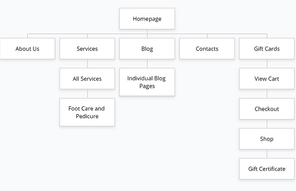
Original Sitemap
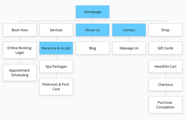
New Sitemap
The highlighted blue boxes indicate which pages I made in my final prototype.
A couple of new pages were added to group the information into more intuitive categories (see 'Services').
Low Fidelity Prototype

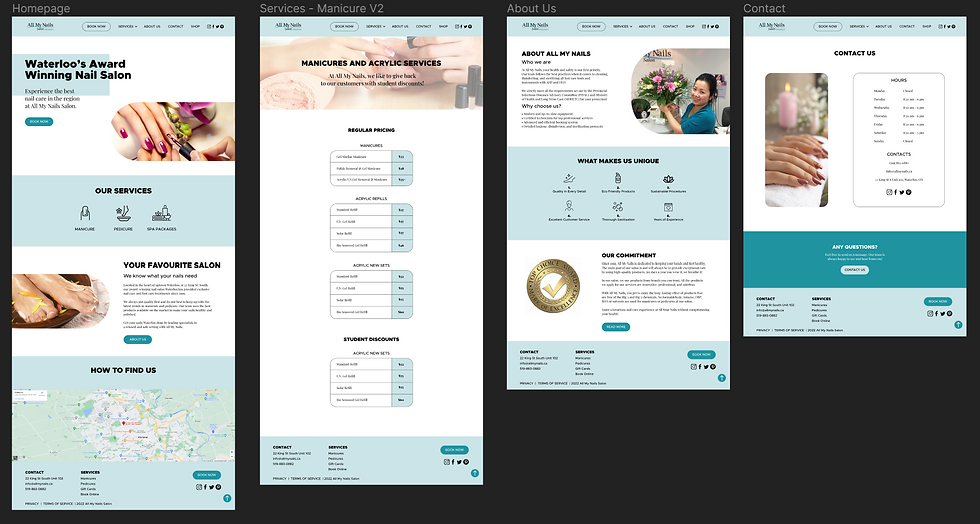
High Fidelity Prototype
Project
Reflection
This project challenged me to think about both stakeholders of the design: the business as well as clients. I had to consider what would be the easiest in terms of website maintenance for the business, as well as what would be the best for their clients' experience.
What was helpful for me during this project was conducting a structured design critique, testing user tasks, and building sitemaps. The full design critique aided me in analyzing details I might have otherwise not redesigned to the extent I did, such as the content.
Building both sitemaps allowed me to compare what changes I wanted to make and helped me see more clearly whether or not they would be useful. The original sitemap also really made it clear just how limited the site was, which wasn't as obvious just from using it.
If I were to redesign another website in the future, I think I would want to experiment more with colour.
This being my first website redesign, I felt like sticking to a fairly monochromatic colour scheme was the safest option but maybe not the most exciting one.